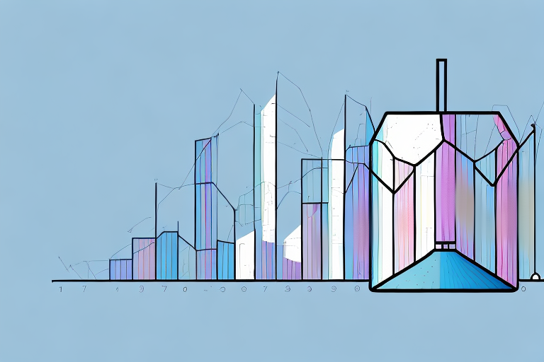
A standard deviation histogram is an effective way to analyze and visualize the distribution of data sets. This type of chart is made up of two different parts: the graph, and the context. The graph is the traditional bar chart, where each bar represents a portion of the data, and the context is description of the data set itself. Making your own standard deviation chart is relatively simple and can be done in a few steps.
What is a Standard Deviation Histogram?
A standard deviation histogram is a tool used to analyze and visualize numerical data. It’s often used for exploratory data analysis or for presentation purposes. The graph displays the distribution of the data sets, showing how often the values occur in relation to each other. This type of histogram is commonly used to compare data from different sources, or to show the variation of values over time.
Standard deviation histograms are useful for identifying outliers in data sets, as well as for determining the overall spread of the data. They can also be used to identify trends in data, such as whether the data is increasing or decreasing over time. Additionally, standard deviation histograms can be used to compare data from different sources, such as comparing the performance of different products or services.
Understanding the Components of a Standard Deviation Histogram
A standard deviation graph consists of two parts: the axis and the bars. The axis can be a line or a grid. It’s labeled with values, so that the viewer can see which values are most common and which are least common. The bars represent the amount of data points within each value range; the length of the bar is proportional to the number of data points that fall within that range.
The standard deviation histogram is a useful tool for visualizing the distribution of data. It can help to identify outliers, or data points that are far from the average. It can also be used to compare different data sets, or to compare the same data set over different time periods. By understanding the components of a standard deviation histogram, you can gain valuable insights into the data you are analyzing.
Preparing Your Data for a Standard Deviation Histogram
Before creating your standard deviation histogram, it’s important to ensure that your data is correctly formatted. If necessary, you should adjust or transform your data so that the values are continuous (e.g. if you are plotting temperature in degrees Celsius, your values should go from 0-100). Additionally, you should create intervals or “bins” for your data–these are the categories that your data points will fall into.
When creating your bins, it’s important to make sure that they are evenly distributed. This will ensure that your data is accurately represented in the histogram. Additionally, you should make sure that the bins are wide enough to capture the range of values in your data set. If the bins are too narrow, some of your data points may be excluded from the histogram.
Creating the Standard Deviation Histogram
Once your data is ready, you can start creating the standard deviation histogram. To do this, first use a graphing program to create an x-axis based on your intervals. Then draw lines based on the number of data points that fall into each interval. Finally, add labels for each interval and make any necessary adjustments.
When creating the histogram, it is important to ensure that the intervals are evenly spaced and that the data points are accurately represented. Additionally, you may want to adjust the scale of the graph to make it easier to read. Once you have finished creating the histogram, you can use it to analyze the data and draw conclusions about the distribution of the data.
Interpreting the Results of a Standard Deviation Histogram
Once you have created your standard deviation histogram, you will be able to begin interpreting your results. The goal is to understand the relationship between different classes of data and determine whether any outliers exist. To do this, you should look at how many data points fall into each interval, and how they are distributed within that interval.
Common Uses of a Standard Deviation Histogram
Standard deviation histograms are a useful tool in many different fields. For example, they can be used to analyze sales figures over time and compare results between different sales groups. They can also be used to analyze market shares, or to compare populations in terms of age or income levels.
Tips for Creating an Accurate Standard Deviation Histogram
Creating an accurate standard deviation histogram requires careful consideration of your data points. Here are some useful tips for creating an accurate histogram:
- Check that your data is correctly formatted before creating the graph
- Create carefully considered intervals or ‘bins’, so that all data points are not grouped together into one category
- Draw lines based on the number of data points that fall into each interval
- Check if there are any outliers that need to be adjusted for
- Label each interval clearly
Following these steps carefully will ensure that you have created an accurate and visually pleasing standard deviation histogram.